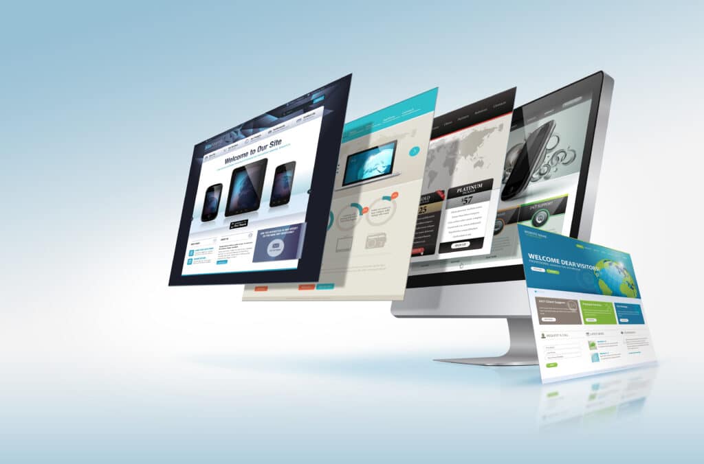
With business being conducted digitally throughout the globe, the way your website looks and works has never been more crucial than it is now.
Here are three easy tips to upgrade your user experience from the Web Developers at Axel & Associates . . .
3 Tips To Increase Website User Experience
First: Make everything easy to read. There are several ways to do this, so here are some helpful ideas: use various text sizes, use various methods to visually emphasize text (such as italics and bold) but not excessively, and don’t make paragraphs too long. Our web builders recommend capping paragraph length to a brief 3-4 sentences, which is not only easier on the eyes but also makes the content easier to follow and retain. All of these tips also help make the content of your page stand out and remain visually engaging so users don’t lose interest, but there is always a balance to strike to keep things tasteful instead of tacky. Bonus tip: make sure that the text color you use works with the background of your page. Sometimes they can be so similar that it makes certain lines or words difficult to read, or the contrast is so strong that it distracts for the wrong reasons and strains the eyes.
Second: Every page should have multimedia. Multimedia is an effective, tried-and-tested way to hold viewer’s attention, especially in text-heavy pages. The easiest way to do this is to include an image or graphic related to the content of each page. However, our web specialists also recommend switching things up and including edited videos in certain places, such as landing pages or pages dedicated to specific products or services. This is because we have found videos to be highly effective for selling specific products in a bit more depth. In fact, it is often more effective to include a single video (of five minutes or less) dedicated to a single product/service than a full page of email or web text. However, make sure not to overdo it — every page of your website should not feature video content.
Third: Make it easy to contact you. This is especially important if visitors have any issues or questions while using your website, which not only makes your team aware of these issues but shows visitors that you are dedicated to addressing their concerns. It is important to not only make your website user-friendly but also to remove as many obstacles as possible to their making a purchase or utilizing your services. Having an easily accessible line of contact is one way to do this so that visitors are feeling that they have personalized, individual attention rather than working through a series of automated steps on their own. One way to make yourself accessible online is to have a Contact Page on your site with more than one way to get in touch, such as an office number as well as email address listed for them to reach out to. Another option is to include a banner that runs throughout your site with the same information listed. Bonus tip: Other features to consider that have become increasingly popular since the Coronavirus pandemic are live online customer support chats as well as video chat options.
Remember: A good rule of thumb is to think of when you’re building or refreshing your website is to consider your own expectations when you visit a website. Ask yourself what are you likely to expect from a website — and what would detract you from engaging with the page?
Stay tuned for more useful web building tips, tricks, and basics from the Axel & Associates web design team!
Need to have your website upgraded, redesigned, or want a new one to bring in more revenue? Reach us at 866-DAVIDAXEL (866-328-4329) or dave@davidaxel.com to discuss the best steps ahead for your business.


